Revamping Chase Payment Solutions’ lead form page
RESEARCH METHODS
Competitor analysis, customer personas, A/B testing
TIMEFRAME
6 months (+3 months for A/B testing)
PLATFORM
Web and mobile
COMPANY
JPMorganChase
As project lead, I revamped Chase Payment Solutions’ lead form page to improve the user experience. Collaborating across product, marketing, and implementation teams, I identified customer pain points and leveraged research to develop a new page within our technical and time constraints.
Chase Payment Solutions (CPS) is a merchant services company under JPMorganChase. We offer a variety of products, including in-store and on-the-go payments processing, online payments, and billing & invoicing.
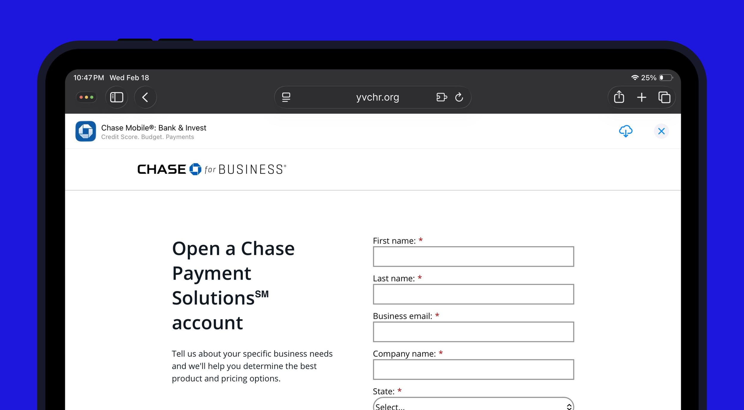
Recognizing the need to update our outdated lead form, we revamped the page to enhance the user experience and improve the lead form submission rate and number of merchant account openings.
OVERVIEW
Objectives

Optimize the user journey via best practices for the small and medium business (SMB) owner audience

Improve the audience’s understanding of CPS products and our value proposition
Challenges
TECHNICAL CONSTRAINTS
The site is hosted on an older tech stack with limited website modules (custom modules take 6 months of extra development)
PRIORITIZATION
Balancing the lead form page with other priority website work (revamps, new launches, expired content, BAU work)
COMPLEX LAUNCH PROCESS
Long website update process with complex stakeholder management
LACK OF USER TESTING
No qualitative testing budget allocated; additionally, usability testing is limited as each version must undergo approval and legal review
Process
DISCOVER
Problem exploration; learn products and website page launch process.
Complete competitive audit and leverage consumer insights.
DEFINE
Organize insights, narrow down features / modules, and define requirements
DEVELOP
Create and test multiple rounds of wireframing.
Gather feedback and reiterate each round.
DELIVER
Launch production and implement final version based on 3-month A/B test tracking key KPIs.
Outcome: successful launch!
+8.5%
3.3%
increase in lead form submission rate
of traffic directed to support center
108k+
average yearly visitors reached
DISCOVER
Understanding business goals and leveraging consumer insights
Before starting the actual design work, I focused on understanding our products and audience. I worked with internal teams including Sales and Product Marketing to deep dive into our products, and worked with Insights to leverage existing research reports (including customer personas).
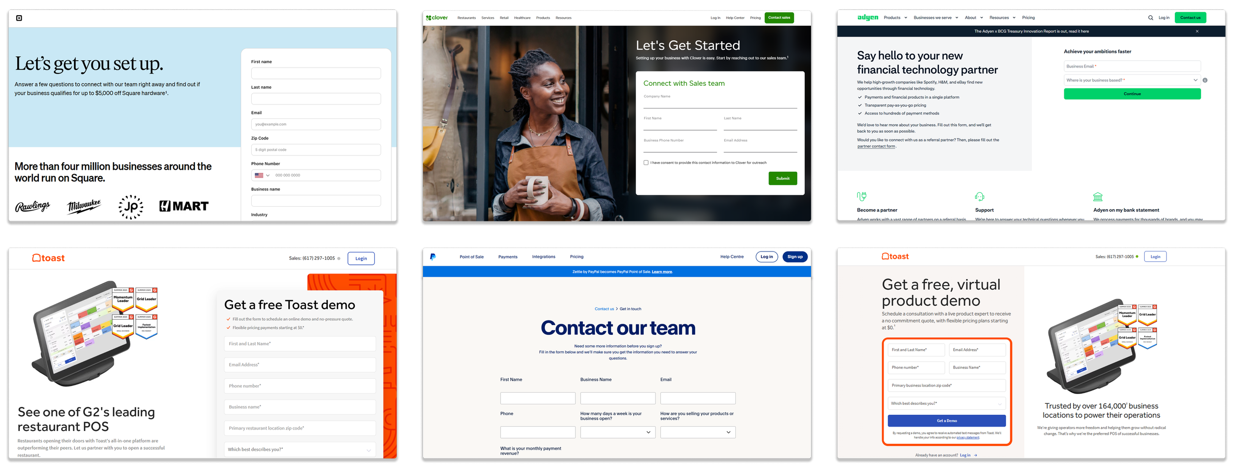
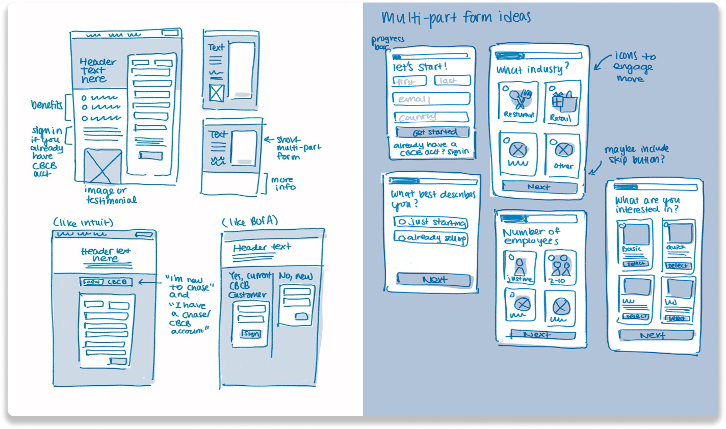
Competitive analysis: industry standard is user-friendly, sleek, and engaging
I completed a competitive analysis on 20+ lead forms from direct and indirect competitors, which were typically more sophisticated. Common themes included:
Split-screen forms
Multi-screen forms
Highly visual (product photos + iconagraphy)
Testimonials or marketing messaging
Frequent design updates and optimizations
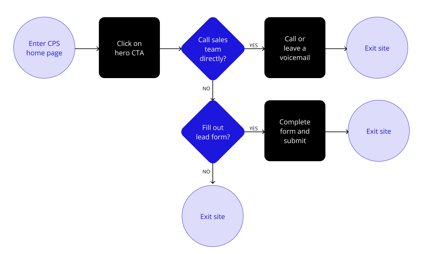
Mapping the user flow
DEFINE
Insights & recommendations from research

Merchants prioritize convenience and ease for processing (“set it and forget it” mindset)

Customers expect a fast and easy onboarding and to start processing quickly

Users seek guidance on CPS offerings and education on our value proposition

Competitor forms are aligned with design best practices and frequently updated

10% of form submissions are support requests, not new customer leads

New form designs must be compatible with all back-end software (AEM, Marketo, etc)
DEVELOP & ITERATE
Focused on incorporating learnings and ideas across our customer personas, insights, and competitive research.
Initial ideation
Feedback & stakeholder management
Presented initial ideas for discussion (and would revisit with stakeholders at each round of iterations).
BUSINESS ALIGNMENT
Sales team
Product team
Product Marketing team
Engagement & Acquisition Marketing team
PRODUCTION ALIGNMENT
MarTech team
Analytics team
Experimentation team
Production team
COMPLIANCE
AdTrax
Legal team
Lo-fi wireframes based on business & production feedback
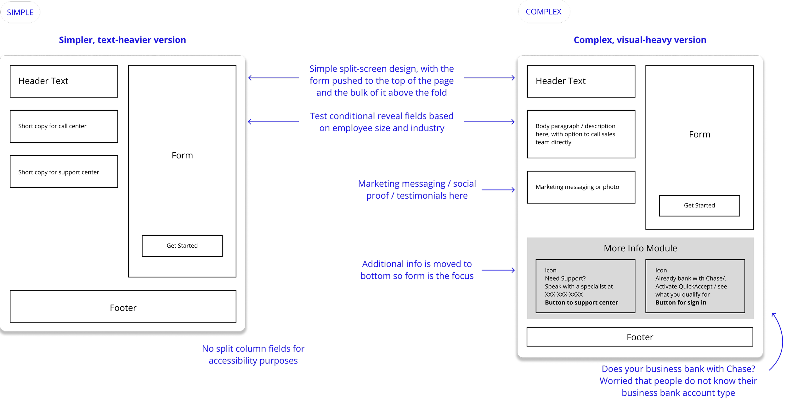
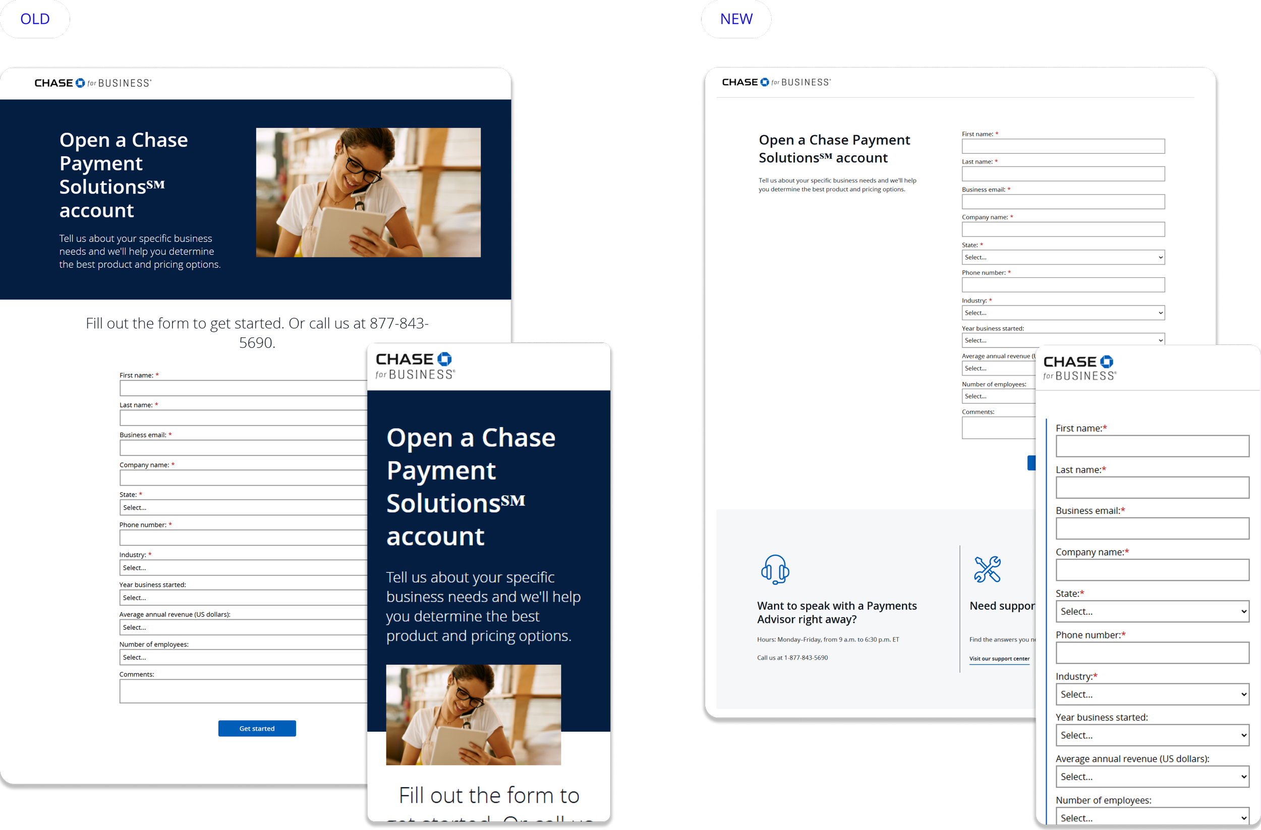
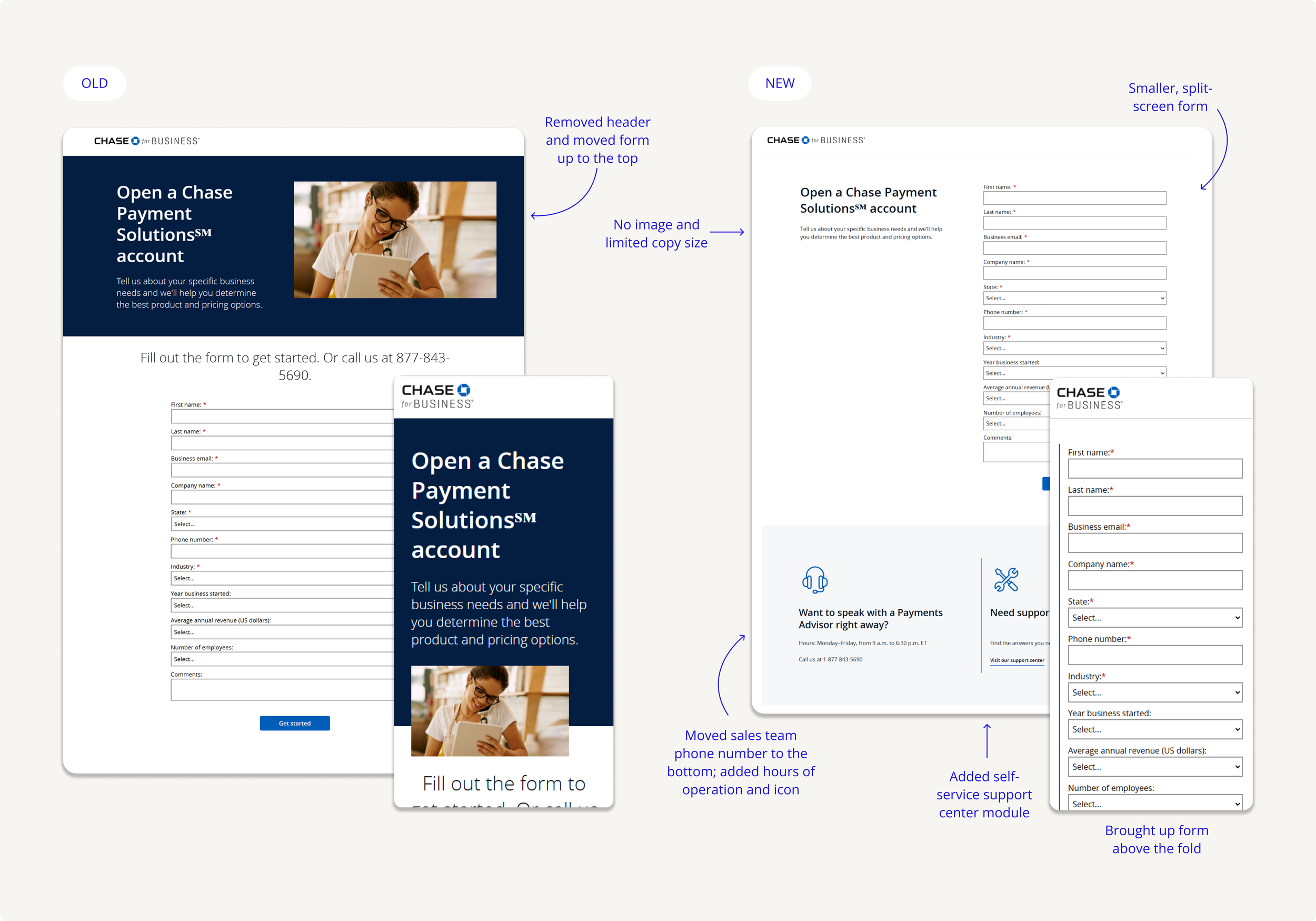
Based on business priorities and limited digital production ability, we decided to focus on a simple split-screen form and implement a faster, simpler redesign that would also be easier to A/B test.
I developed 2 different versions, a simple text-heavy version and a complex version with an additional module underneath.
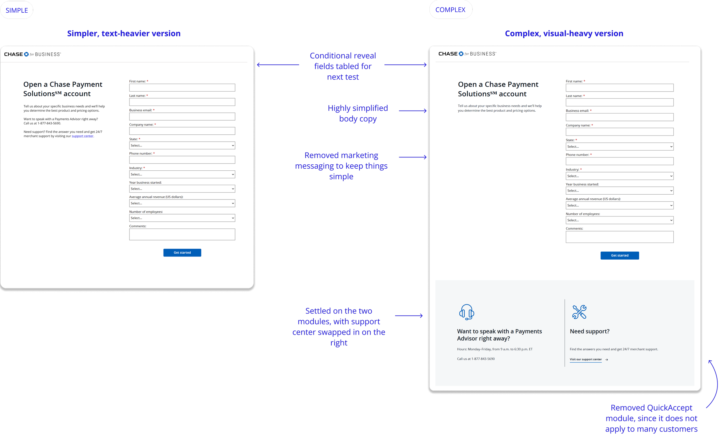
Iterated with hi-fi wireframes
After another round of feedback and iteration, I developed the final designs. We achieved alignment with all stakeholders including leadership and submitted through legal & regulatory review.
DELIVERY
Successful adoption of Version C after 3-month A/B/C test!
Worked with Experimentation team and Analytics team to track 3 key metrics until we reached statistical significance:
Lead form submit rate
Salesforce booking rate
Support center traffic
Version C showed the highest success rate and was implemented permanently. See the lead form page live!
+8.5%
increase in lead form submission rate
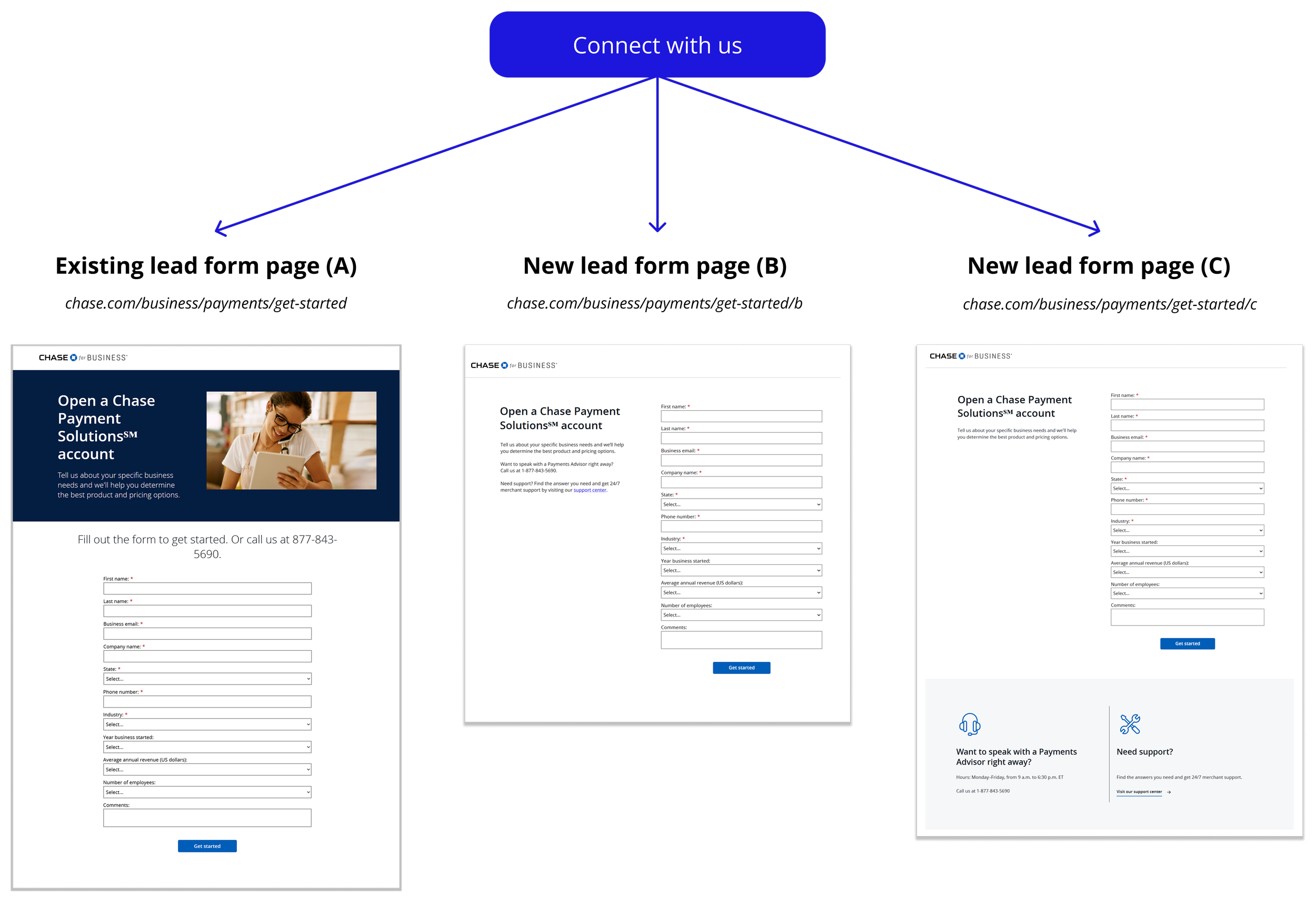
Final version!
Learnings

Finding creative solutions to constraints
We were challenged to find opportunities that worked within technical, brand, and business constraints. Having these limits pushed me to take a creative approach that would balance all priorities and evolve as new information or needs were clarified.

Collaboration & design advocacy
In navigating a complicated stakeholder management, I learned the importance of effective communication and collaboration. Involving collaborators from the start and clear justification behind design decisions ensured that our launch went smoothly.

Advancing my design skills
I developed a deeper understanding of experience design principles, and how to create and refine wireframes effectively. Additionally, I learned to iterate on existing design systems and reinforce the quality and consistency of user experiences.

Next steps
For next steps, we would test new features like progressive disclosure forms and different modules (for benefits or new products). Ideally, we would include qualitative interviews and usability testing, but we lacked the budget allocation at the time.